考试报名
考试报名
考试内容
考试大纲
在线客服
返回顶部

备考刷题,请到

CDA认证小程序

The chart provides statistical data on the number of registered users with different registration dates and the number of daily logins after registration. Please answer the following questions: 
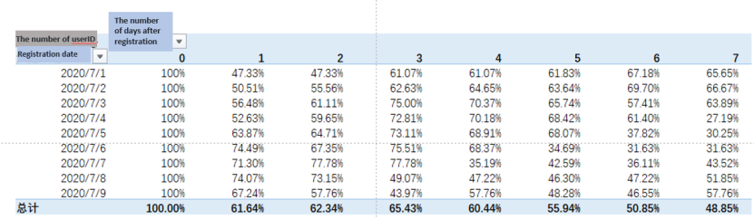
If you want to understand the overall retention rate of all registered users in the past 7 days, which type of chart would be more appropriate?
A. Clustered bar chart
B. Line chart
C. Pie chart
D. Waterfall chart
上一题
下一题
收藏
点赞
评论
题目解析
题目评论(0)

A line chart can show the trend of user retention rate over time.

要了解过去7天所有注册用户的整体留存率,最合适的图表类型是B: 折线图(Line chart)。

### 专业分析:
1. **折线图(Line chart)**:
- **优点**:折线图能够清晰地展示数据随时间的变化趋势。对于留存率这种需要观察一段时间内变化的数据,折线图能够直观地显示每一天的留存率变化情况。
- **适用性**:在展示时间序列数据(如每天的留存率)时,折线图是最常用和最有效的图表类型。

2. **簇状条形图(Clustered bar chart)**:
- **优点**:适合比较不同类别的数据。
- **缺点**:不适合展示随时间变化的趋势,尤其是当数据点较多时,条形图会显得杂乱。

3. **饼图(Pie chart)**:
- **优点**:适合展示组成部分的比例。
- **缺点**:不适合展示时间序列数据,无法反映留存率的变化趋势。

4. **瀑布图(Waterfall chart)**:
- **优点**:适合展示数据的累积和分解过程。
- **缺点**:不适合展示时间序列数据,尤其是每日变化的留存率。

综上所述,折线图(Line chart)最适合用于展示过去7天所有注册用户的整体留存率,因为它能够清晰地反映出留存率随时间的变化趋势。